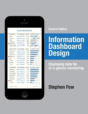

Information Dashboard Design Upplaga 2
- Upplaga: 2a upplagan
- Utgiven: 2013
- ISBN: 9781938377006
- Sidor: 260 st
- Förlag: Analytics Press
- Format: Inbunden
- Språk: Engelska
Om boken
A leader in the field of data visualization, Stephen Few exposes the common problems in dashboard design and describes its best practices in great detail and with a multitude of examples in this updated second edition. According to the author, dashboards have become a popular means to present critical information at a glance, yet few do so effectively. He purports that when designed well, dashboards engage the power of visual perception to communicate a dense collection of information efficiently and with exceptional clarity and that visual design skills that address the unique challenges of dashboards are not intuitive but rather learned. The book not only teaches how to design dashboards but also gives a deep understanding of the concepts—rooted in brain science—that explain the why behind the how. This revised edition offers six new chapters with sections that focus on fundamental considerations while assessing requirements, in-depth instruction in the design of bullet graphs and sparklines, and critical steps to follow during the design process. Examples of graphics and dashboards have been updated throughout, including additional samples of well-designed dashboards.
Åtkomstkoder och digitalt tilläggsmaterial garanteras inte med begagnade böcker
Mer om Information Dashboard Design (2013)
I augusti 2013 släpptes boken Information Dashboard Design skriven av Stephen Few. Det är den 2a upplagan av kursboken. Den är skriven på engelska och består av 260 sidor. Förlaget bakom boken är Analytics Press.
Köp boken Information Dashboard Design på Studentapan och spara pengar.
Referera till Information Dashboard Design (Upplaga 2)
Harvard
Few, S. (2013). Information Dashboard Design. 2:a uppl. Analytics Press.
Oxford
Few, Stephen, Information Dashboard Design, 2 uppl. (Analytics Press, 2013).
APA
Few, S. (2013). Information Dashboard Design (2:a uppl.). Analytics Press.
Vancouver
Few S. Information Dashboard Design. 2:a uppl. Analytics Press; 2013.


